کد ساعت آنالوگ | چهار آنلاین
به ادامه مطلب بروید
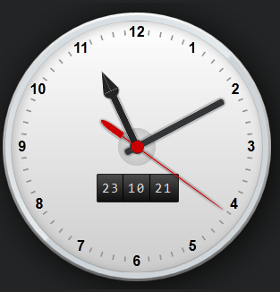
کدphp :
<!DOCTYPE html>
<html lang="en">
<head>
<meta charset="UTF-8">
<title>s1i2n3a4.loxblog.com | 4oNliNe</title>
<style type="text/css">
body {
font-size: 62.5%;
margin: 1em;
background: #232425
}
ul {
list-style: none;
margin: 0;
padding: 0
}
#watch {
font-size: 1em;
position: relative
}
#watch .frame-face {
position: relative;
width: 30em;
height: 30em;
margin: 2em auto;
border-radius: 15em;
background: -webkit-linear-gradient(top, #f9f9f9, #666);
background: -moz-linear-gradient(top, #f9f9f9, #666);
background: linear-gradient(to bottom, #f9f9f9, #666);
box-shadow: rgba(0, 0, 0, .8) .5em .5em 4em;
}
#watch .frame-face:before {
content: ';
width: 29.4em;
height: 29.4em;
border-radius: 14.7em;
position: absolute;
top: .3em;
left: .3em;
background: -webkit-linear-gradient(135deg, rgba(246, 248, 249, 0) 0%, rgba(229, 235, 238, 1) 50%, rgba(205, 212, 217, 1) 51%, rgba(245, 247, 249, 0) 100%), -webkit-radial-gradient(center, ellipse cover, rgba(246, 248, 249, 1) 0%, rgba(229, 235, 238, 1) 65%, rgba(205, 212, 217, 1) 66%, rgba(245, 247, 249, 1) 100%);
background: -moz-linear-gradient(135deg, rgba(246, 248, 249, 0) 0%, rgba(229, 235, 238, 1) 50%, rgba(205, 212, 217, 1) 51%, rgba(245, 247, 249, 0) 100%), -moz-radial-gradient(center, ellipse cover, rgba(246, 248, 249, 1) 0%, rgba(229, 235, 238, 1) 65%, rgba(205, 212, 217, 1) 66%, rgba(245, 247, 249, 1) 100%);
background: linear-gradient(135deg, rgba(246, 248, 249, 0) 0%, rgba(229, 235, 238, 1) 50%, rgba(205, 212, 217, 1) 51%, rgba(245, 247, 249, 0) 100%), radial-gradient(ellipse at center, rgba(246, 248, 249, 1) 0%, rgba(229, 235, 238, 1) 65%, rgba(205, 212, 217, 1) 66%, rgba(245, 247, 249, 1) 100%);
}
#watch .frame-face:after {
content: ';
width: 28em;
height: 28em;
border-radius: 14.2em;
position: absolute;
top: .9em;
left: .9em;
box-shadow: inset rgba(0, 0, 0, .2) .2em .2em 1em;
border: .1em solid rgba(0, 0, 0, .2);
background: -webkit-linear-gradient(top, #fff, #ccc);
background: -moz-linear-gradient(top, #fff, #ccc);
background: linear-gradient(to bottom, #fff, #ccc);
}
#watch .minute-marks li {
display: block;
width: .2em;
height: .6em;
background: #929394;
position: absolute;
top: 50%;
left: 50%;
margin: -.4em 0 0 -.1em;
}
#watch .minute-marks li:first-child {
transform: rotate(6deg) translateY(-12.7em)
}
#watch .minute-marks li:nth-child(2) {
transform: rotate(12deg) translateY(-12.7em)
}
#watch .minute-marks li:nth-child(3) {
transform: rotate(18deg) translateY(-12.7em)
}
#watch .minute-marks li:nth-child(4) {
transform: rotate(24deg) translateY(-12.7em)
}
#watch .minute-marks li:nth-child(5) {
transform: rotate(36deg) translateY(-12.7em)
}
#watch .minute-marks li:nth-child(6) {
transform: rotate(42deg) translateY(-12.7em)
}
#watch .minute-marks li:nth-child(7) {
transform: rotate(48deg) translateY(-12.7em)
}
#watch .minute-marks li:nth-child(8) {
transform: rotate(54deg) translateY(-12.7em)
}
#watch .minute-marks li:nth-child(9) {
transform: rotate(66deg) translateY(-12.7em)
}
#watch .minute-marks li:nth-child(10) {
transform: rotate(72deg) translateY(-12.7em)
}
#watch .minute-marks li:nth-child(11) {
transform: rotate(78deg) translateY(-12.7em)
}
#watch .minute-marks li:nth-child(12) {
transform: rotate(84deg) translateY(-12.7em)
}
#watch .minute-marks li:nth-child(13) {
transform: rotate(96deg) translateY(-12.7em)
}
#watch .minute-marks li:nth-child(14) {
transform: rotate(102deg) translateY(-12.7em)
}
#watch .minute-marks li:nth-child(15) {
transform: rotate(108deg) translateY(-12.7em)
}
#watch .minute-marks li:nth-child(16) {
transform: rotate(114deg) translateY(-12.7em)
}
#watch .minute-marks li:nth-child(17) {
transform: rotate(126deg) translateY(-12.7em)
}
#watch .minute-marks li:nth-child(18) {
transform: rotate(132deg) translateY(-12.7em)
}
#watch .minute-marks li:nth-child(19) {
transform: rotate(138deg) translateY(-12.7em)
}
#watch .minute-marks li:nth-child(20) {
transform: rotate(144deg) translateY(-12.7em)
}
#watch .minute-marks li:nth-child(21) {
transform: rotate(156deg) translateY(-12.7em)
}
#watch .minute-marks li:nth-child(22) {
transform: rotate(162deg) translateY(-12.7em)
}
#watch .minute-marks li:nth-child(23) {
transform: rotate(168deg) translateY(-12.7em)
}
#watch .minute-marks li:nth-child(24) {
transform: rotate(174deg) translateY(-12.7em)
}
#watch .minute-marks li:nth-child(25) {
transform: rotate(186deg) translateY(-12.7em)
}
#watch .minute-marks li:nth-child(26) {
transform: rotate(192deg) translateY(-12.7em)
}
#watch .minute-marks li:nth-child(27) {
transform: rotate(198deg) translateY(-12.7em)
}
#watch .minute-marks li:nth-child(28) {
transform: rotate(204deg) translateY(-12.7em)
}
#watch .minute-marks li:nth-child(29) {
transform: rotate(216deg) translateY(-12.7em)
}
#watch .minute-marks li:nth-child(30) {
transform: rotate(222deg) translateY(-12.7em)
}
#watch .minute-marks li:nth-child(31) {
transform: rotate(228deg) translateY(-12.7em)
}
#watch .minute-marks li:nth-child(32) {
transform: rotate(234deg) translateY(-12.7em)
}
#watch .minute-marks li:nth-child(33) {
transform: rotate(246deg) translateY(-12.7em)
}
#watch .minute-marks li:nth-child(34) {
transform: rotate(252deg) translateY(-12.7em)
}
#watch .minute-marks li:nth-child(35) {
transform: rotate(258deg) translateY(-12.7em)
}
#watch .minute-marks li:nth-child(36) {
transform: rotate(264deg) translateY(-12.7em)
}
#watch .minute-marks li:nth-child(37) {
transform: rotate(276deg) translateY(-12.7em)
}
#watch .minute-marks li:nth-child(38) {
transform: rotate(282deg) translateY(-12.7em)
}
#watch .minute-marks li:nth-child(39) {
transform: rotate(288deg) translateY(-12.7em)
}
#watch .minute-marks li:nth-child(40) {
transform: rotate(294deg) translateY(-12.7em)
}
#watch .minute-marks li:nth-child(41) {
transform: rotate(306deg) translateY(-12.7em)
}
#watch .minute-marks li:nth-child(42) {
transform: rotate(312deg) translateY(-12.7em)
}
#watch .minute-marks li:nth-child(43) {
transform: rotate(318deg) translateY(-12.7em)
}
#watch .minute-marks li:nth-child(44) {
transform: rotate(324deg) translateY(-12.7em)
}
#watch .minute-marks li:nth-child(45) {
transform: rotate(336deg) translateY(-12.7em)
}
#watch .minute-marks li:nth-child(46) {
transform: rotate(342deg) translateY(-12.7em)
}
#watch .minute-marks li:nth-child(47) {
transform: rotate(348deg) translateY(-12.7em)
}
#watch .minute-marks li:nth-child(48) {
transform: rotate(354deg) translateY(-12.7em)
}
#watch .digits {
width: 30em;
height: 30em;
border-radius: 15em;
position: absolute;
top: 0;
left: 50%;
margin-left: -15em;
}
#watch .digits li {
font-size: 1.6em;
display: block;
width: 1.6em;
height: 1.6em;
position: absolute;
top: 50%;
left: 50%;
line-height: 1.6em;
text-align: center;
margin: -.8em 0 0 -.8em;
font-weight: bold;
}
#watch .digits li:nth-child(1) {
transform: translate(3.9em, -6.9em)
}
#watch .digits li:nth-child(2) {
transform: translate(6.9em, -4em)
}
#watch .digits li:nth-child(3) {
transform: translate(8em, 0)
}
#watch .digits li:nth-child(4) {
transform: translate(6.8em, 4em)
}
#watch .digits li:nth-child(5) {
transform: translate(3.9em, 6.9em)
}
#watch .digits li:nth-child(6) {
transform: translate(0, 8em)
}
#watch .digits li:nth-child(7) {
transform: translate(-3.9em, 6.9em)
}
#watch .digits li:nth-child(8) {
transform: translate(-6.8em, 4em)
}
#watch .digits li:nth-child(9) {
transform: translate(-8em, 0)
}
#watch .digits li:nth-child(10) {
transform: translate(-6.9em, -4em)
}
#watch .digits li:nth-child(11) {
transform: translate(-3.9em, -6.9em)
}
#watch .digits li:nth-child(12) {
transform: translate(0, -8em)
}
#watch .digits:before {
content: ';
width: 1.6em;
height: 1.6em;
border-radius: .8em;
position: absolute;
top: 50%;
left: 50%;
margin: -.8em 0 0 -.8em;
background: #121314;
}
#watch .digits:after {
content: ';
width: 4em;
height: 4em;
border-radius: 2.2em;
position: absolute;
top: 50%;
left: 50%;
margin: -2.1em 0 0 -2.1em;
border: .1em solid #c6c6c6;
background: -webkit-radial-gradient(center, ellipse cover, rgba(200, 200, 200, 0), rgba(190, 190, 190, 1) 90%, rgba(130, 130, 130, 1) 100%);
background: -moz-radial-gradient(center, ellipse cover, rgba(200, 200, 200, 0), rgba(190, 190, 190, 1) 90%, rgba(130, 130, 130, 1) 100%);
background: radial-gradient(ellipse at center, rgba(200, 200, 200, 0), rgba(190, 190, 190, 1) 90%, rgba(130, 130, 130, 1) 100%);
}
@keyframes hours {
to {
transform: rotate(335deg)
}
}
#watch .hours-hand {
width: .8em;
height: 7em;
border-radius: 0 0 .9em .9em;
background: #232425;
position: absolute;
bottom: 50%;
left: 50%;
margin: 0 0 -.8em -.4em;
box-shadow: #232425 0 0 2px;
transform-origin: 0.4em 6.2em;
transform: rotate(-25deg);
animation: hours 43200s linear 0s infinite;
}
#watch .hours-hand:before {
content: ';
background: inherit;
width: 1.8em;
height: .8em;
border-radius: 0 0 .8em .8em;
box-shadow: #232425 0 0 1px;
position: absolute;
top: -.7em;
left: -.5em;
}
#watch .hours-hand:after {
content: ';
width: 0;
height: 0;
border: .9em solid #232425;
border-width: 0 .9em 2.4em .9em;
border-left-color: transparent;
border-right-color: transparent;
position: absolute;
top: -3.1em;
left: -.5em;
}
@keyframes minutes {
to {
transform: rotate(422deg)
}
}
#watch .minutes-hand {
width: .8em;
height: 12.5em;
border-radius: .5em;
background: #343536;
position: absolute;
bottom: 50%;
left: 50%;
margin: 0 0 -1.5em -.4em;
box-shadow: #343536 0 0 2px;
transform-origin: 0.4em 11em;
transform: rotate(62deg);
animation: minutes 3600s linear 0s infinite;
}
@keyframes seconds {
to {
transform: rotate(480deg)
}
}
#watch .seconds-hand {
width: .2em;
height: 14em;
border-radius: .1em .1em 0 0/10em 10em 0 0;
background: #c00;
position: absolute;
bottom: 50%;
left: 50%;
margin: 0 0 -2em -.1em;
box-shadow: rgba(0, 0, 0, .8) 0 0 .2em;
transform-origin: 0.1em 12em;
transform: rotate(120deg);
animation: seconds 60s steps(60, end) 0s infinite;
}
#watch .seconds-hand:after {
content: ';
width: 1.4em;
height: 1.4em;
border-radius: .7em;
background: inherit;
position: absolute;
left: -.65em;
bottom: 1.35em;
}
#watch .seconds-hand:before {
content: ';
width: .8em;
height: 3em;
border-radius: .2em .2em .4em .4em/.2em .2em 2em 2em;
box-shadow: rgba(0, 0, 0, .8) 0 0 .2em;
background: inherit;
position: absolute;
left: -.35em;
bottom: -3em;
}
#watch .digital-wrap {
width: 9em;
height: 3em;
border: .1em solid #222;
border-radius: .2em;
position: absolute;
top: 50%;
left: 50%;
margin: 3em 0 0 -4.5em;
overflow: hidden;
background: #4c4c4c;
background: -webkit-linear-gradient(top, #4c4c4c 0%, #0f0f0f 100%);
background: -moz-linear-gradient(top, #4c4c4c 0%, #0f0f0f 100%);
background: -ms-linear-gradient(top, #4c4c4c 0%, #0f0f0f 100%);
background: -o-linear-gradient(top, #4c4c4c 0%, #0f0f0f 100%);
background: linear-gradient(to bottom, #4c4c4c 0%, #0f0f0f 100%);
}
#watch .digital-wrap ul {
float: left;
width: 2.85em;
height: 3em;
border-right: .1em solid #000;
color: #ddd;
font-family: Consolas, monaco, monospace;
}
#watch .digital-wrap ul:last-child {
border: none
}
#watch .digital-wrap li {
font-size: 1.5em;
line-height: 2;
letter-spacing: 2px;
text-align: center;
position: relative;
left: 1px;
}
#watch .digit-minutes li {
animation: dsm 3600s steps(60, end) 0s infinite;
}
#watch .digit-seconds li {
animation: dsm 60s steps(60, end) 0s infinite;
}
@keyframes dsm {
to {
transform: translateY(-120em)
}
}
</style>
</head>
<body>
<div id="watch">
<div class="frame-face"></div>
<ul class="minute-marks">
<li></li>
<li></li>
<li></li>
<li></li>
<li></li>
<li></li>
<li></li>
<li></li>
<li></li>
<li></li>
<li></li>
<li></li>
<li></li>
<li></li>
<li></li>
<li></li>
<li></li>
<li></li>
<li></li>
<li></li>
<li></li>
<li></li>
<li></li>
<li></li>
<li></li>
<li></li>
<li></li>
<li></li>
<li></li>
<li></li>
<li></li>
<li></li>
<li></li>
<li></li>
<li></li>
<li></li>
<li></li>
<li></li>
<li></li>
<li></li>
<li></li>
<li></li>
<li></li>
<li></li>
<li></li>
<li></li>
<li></li>
<li></li>
</ul>
<div class="digital-wrap">
<ul class="digit-hours">
<li>23</li>
<li>00</li>
<li>01</li>
<li>02</li>
<li>03</li>
<li>04</li>
<li>05</li>
<li>06</li>
<li>07</li>
<li>08</li>
<li>09</li>
<li>10</li>
<li>11</li>
<li>12</li>
<li>13</li>
<li>14</li>
<li>15</li>
<li>16</li>
<li>17</li>
<li>18</li>
<li>19</li>
<li>20</li>
<li>21</li>
<li>22</li>
</ul>
<ul class="digit-minutes">
<li>10</li>
<li>11</li>
<li>12</li>
<li>13</li>
<li>14</li>
<li>15</li>
<li>16</li>
<li>17</li>
<li>18</li>
<li>19</li>
<li>20</li>
<li>21</li>
<li>22</li>
<li>23</li>
<li>24</li>
<li>25</li>
<li>26</li>
<li>27</li>
<li>28</li>
<li>29</li>
<li>30</li>
<li>31</li>
<li>32</li>
<li>33</li>
<li>34</li>
<li>35</li>
<li>36</li>
<li>37</li>
<li>38</li>
<li>39</li>
<li>40</li>
<li>41</li>
<li>42</li>
<li>43</li>
<li>44</li>
<li>45</li>
<li>46</li>
<li>47</li>
<li>48</li>
<li>49</li>
<li>50</li>
<li>51</li>
<li>52</li>
<li>53</li>
<li>54</li>
<li>55</li>
<li>56</li>
<li>57</li>
<li>58</li>
<li>59</li>
<li>00</li>
<li>01</li>
<li>02</li>
<li>03</li>
<li>04</li>
<li>05</li>
<li>06</li>
<li>07</li>
<li>08</li>
<li>09</li>
</ul>
<ul class="digit-seconds">
<li>20</li>
<li>21</li>
<li>22</li>
<li>23</li>
<li>24</li>
<li>25</li>
<li>26</li>
<li>27</li>
<li>28</li>
<li>29</li>
<li>30</li>
<li>31</li>
<li>32</li>
<li>33</li>
<li>34</li>
<li>35</li>
<li>36</li>
<li>37</li>
<li>38</li>
<li>39</li>
<li>40</li>
<li>41</li>
<li>42</li>
<li>43</li>
<li>44</li>
<li>45</li>
<li>46</li>
<li>47</li>
<li>48</li>
<li>49</li>
<li>50</li>
<li>51</li>
<li>52</li>
<li>53</li>
<li>54</li>
<li>55</li>
<li>56</li>
<li>57</li>
<li>58</li>
<li>59</li>
<li>00</li>
<li>01</li>
<li>02</li>
<li>03</li>
<li>04</li>
<li>05</li>
<li>06</li>
<li>07</li>
<li>08</li>
<li>09</li>
<li>10</li>
<li>11</li>
<li>12</li>
<li>13</li>
<li>14</li>
<li>15</li>
<li>16</li>
<li>17</li>
<li>18</li>
<li>19</li>
</ul>
</div>
<ul class="digits">
<li>1</li>
<li>2</li>
<li>3</li>
<li>4</li>
<li>5</li>
<li>6</li>
<li>7</li>
<li>8</li>
<li>9</li>
<li>10</li>
<li>11</li>
<li>12</li>
</ul>
<div class="hours-hand"></div>
<div class="minutes-hand"></div>
<div class="seconds-hand"></div>
</div>
</body>
</html>
افزودن به علاقهمندیها
حذف از علاقهمندی
- 07 شهریور 1394
- 0 دیدگاه
- 5158 بازدید